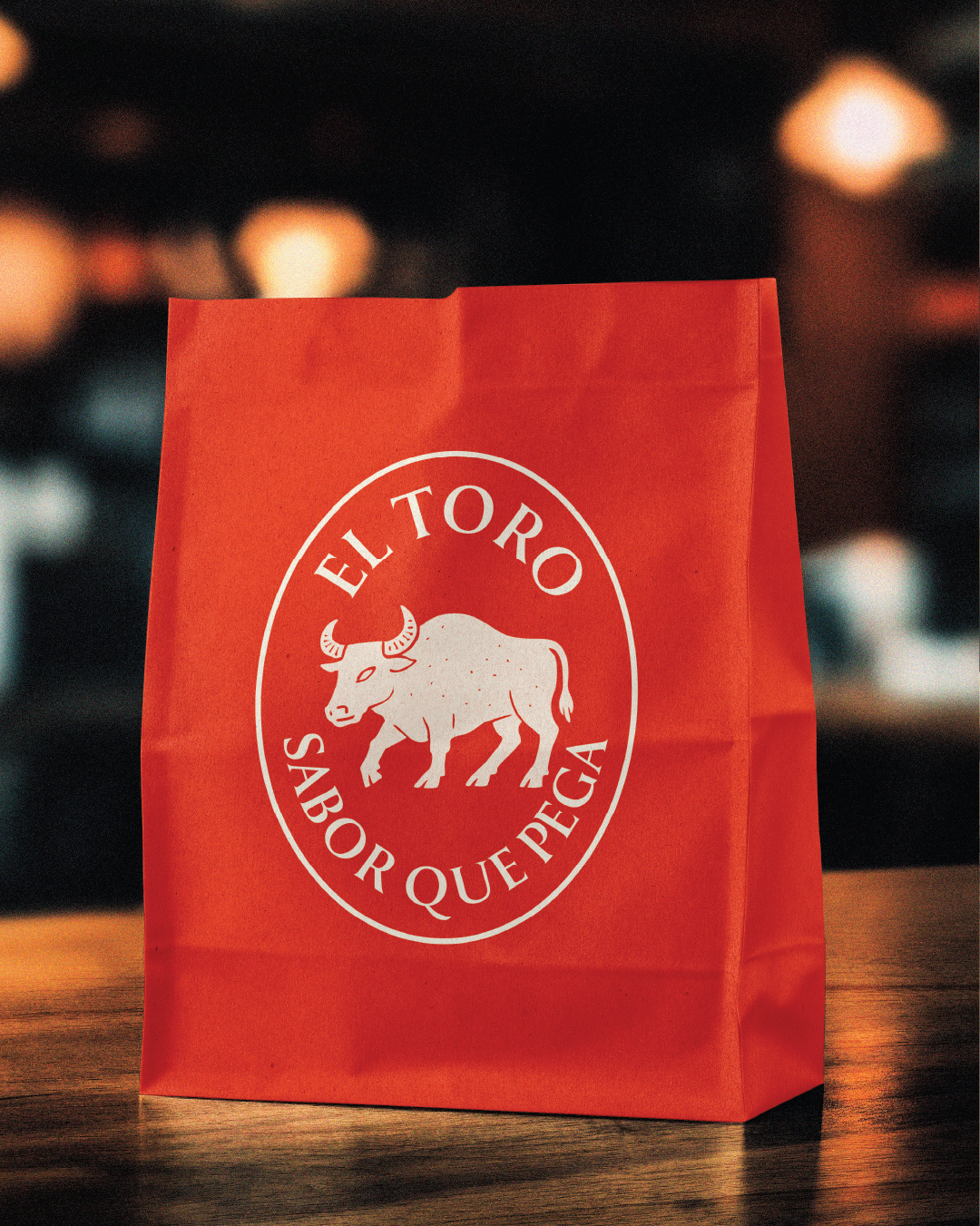
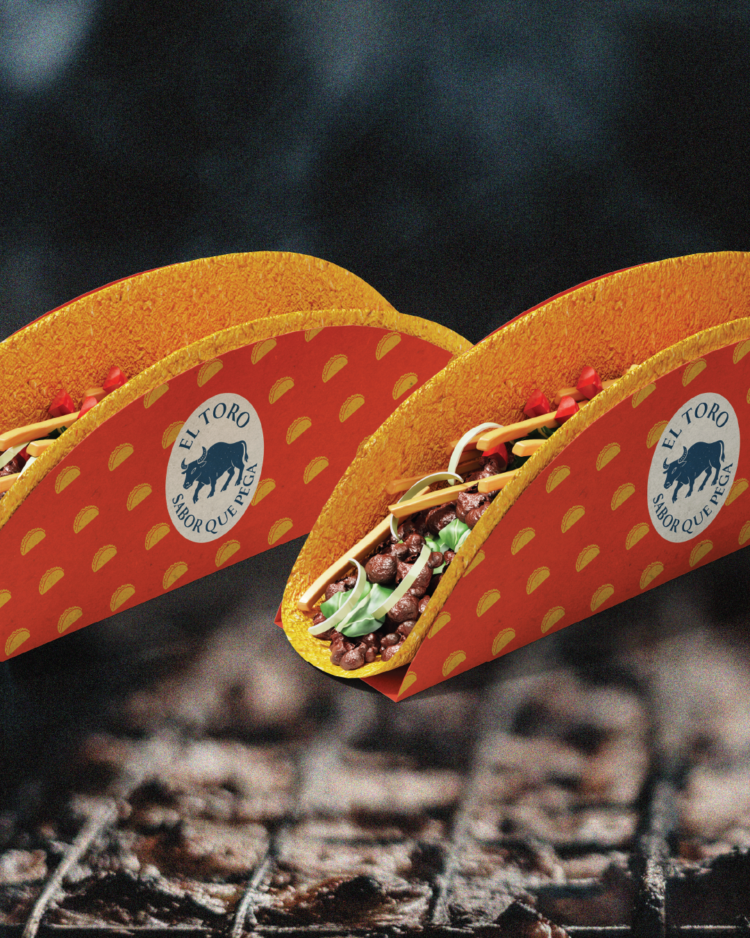
El toro
sabor que pega.


El Toro is a modern Mexican restaurant chain built on a passion for authentic flavours and vibrant traditions. The goal was to create a bold, culturally rich brand identity that captures the spirit of Mexico while appealing to a new generation of diners. The branding embraces a dynamic, vintage-inspired aesthetic with organic lines, vibrant desert colours, and sleek typography, setting El Toro apart from generic, commercialised eateries. It speaks to food lovers seeking an unforgettable, genuine taste experience in a lively, welcoming atmosphere.
Service Provided: Branding / Packaging / Marketing Materials
Client: El Toro
Year: 2025
THE LOGO.

The typography, a sleek and stylised sans serif, complements the organic form of the bull with clean, rhythmic lines that feel both traditional and modern. Framed within a structured box, the logo balances fluidity and control, evoking the craftsmanship and heart behind every dish. The addition wording along the sides further grounds the brand in its cultural authenticity, making it clear that El Toro is more than a restaurant it’s a celebration of true Mexican soul.
The El Toro logo is a bold and character-driven mark that fuses traditional Mexican heritage with a modern, distinctive edge. Central to the design is a hand-drawn bull illustration—raw, dynamic, and textured—which immediately evokes strength, authenticity, and cultural pride.
The logo is highly versatile, memorable, and perfectly aligned with the brand’s identity: authentic, powerful, and full of flavour.